



While the organization’s broader strategic direction was already established internally, Wall On The Fly focused on translating that strategy into a cohesive visual and communications system centered around advocacy, connection, and the long-term impact of care.
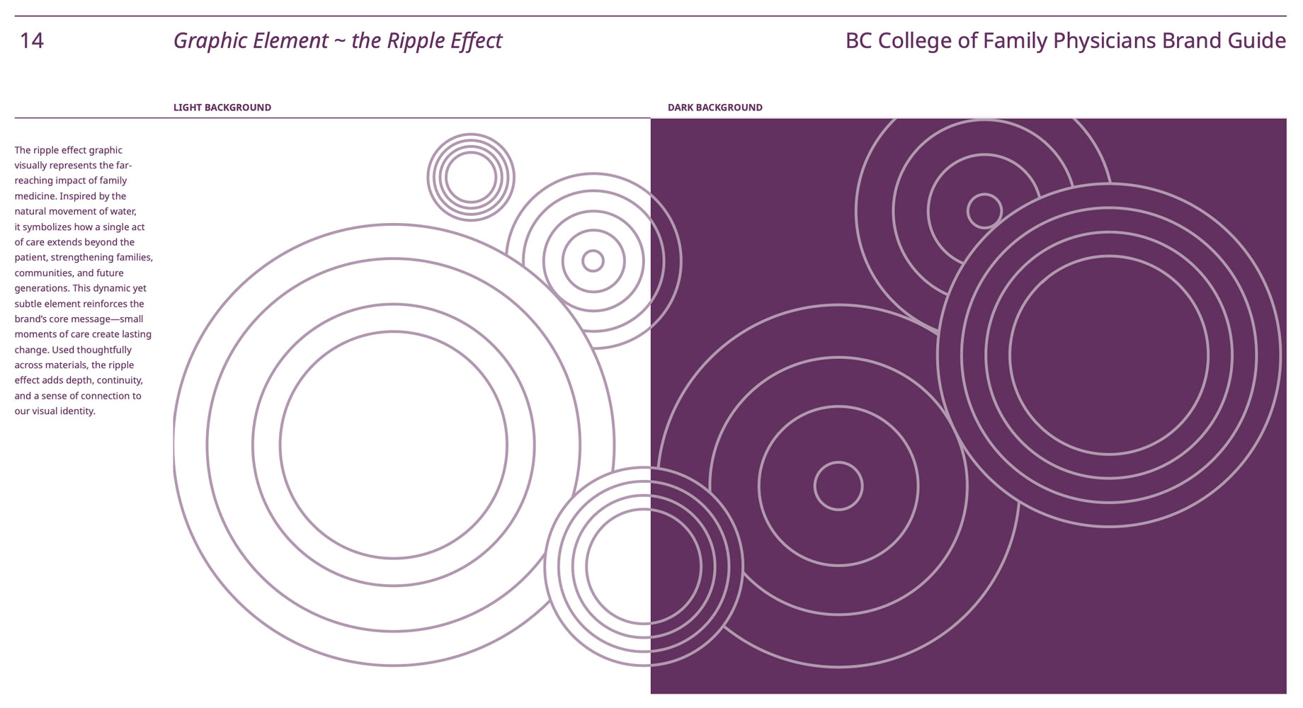
At the center of the identity was the “Ripple Effect” — a graphic language inspired by the expanding influence of family medicine within families, communities, and the broader healthcare system.
The identity system extended across digital, environmental, and administrative applications, including the design of a new website developed in collaboration with web developers to support advocacy, member communications, resources, and public engagement.
The resulting platform helped reposition BC College of Family Physicians with a clearer, more contemporary identity capable of balancing professionalism, advocacy, accessibility, and human connection during a period of significant transformation within primary healthcare in British Columbia.