
The work explored how the identity itself could embody plurality, participation, and collective emergence rather than imposing a singular visual system onto the initiative.
Because the consultation centered youth voices and intergenerational collaboration, younger designers were intentionally brought into the creative process itself — allowing the visual language to emerge through collaboration rather than top-down interpretation.
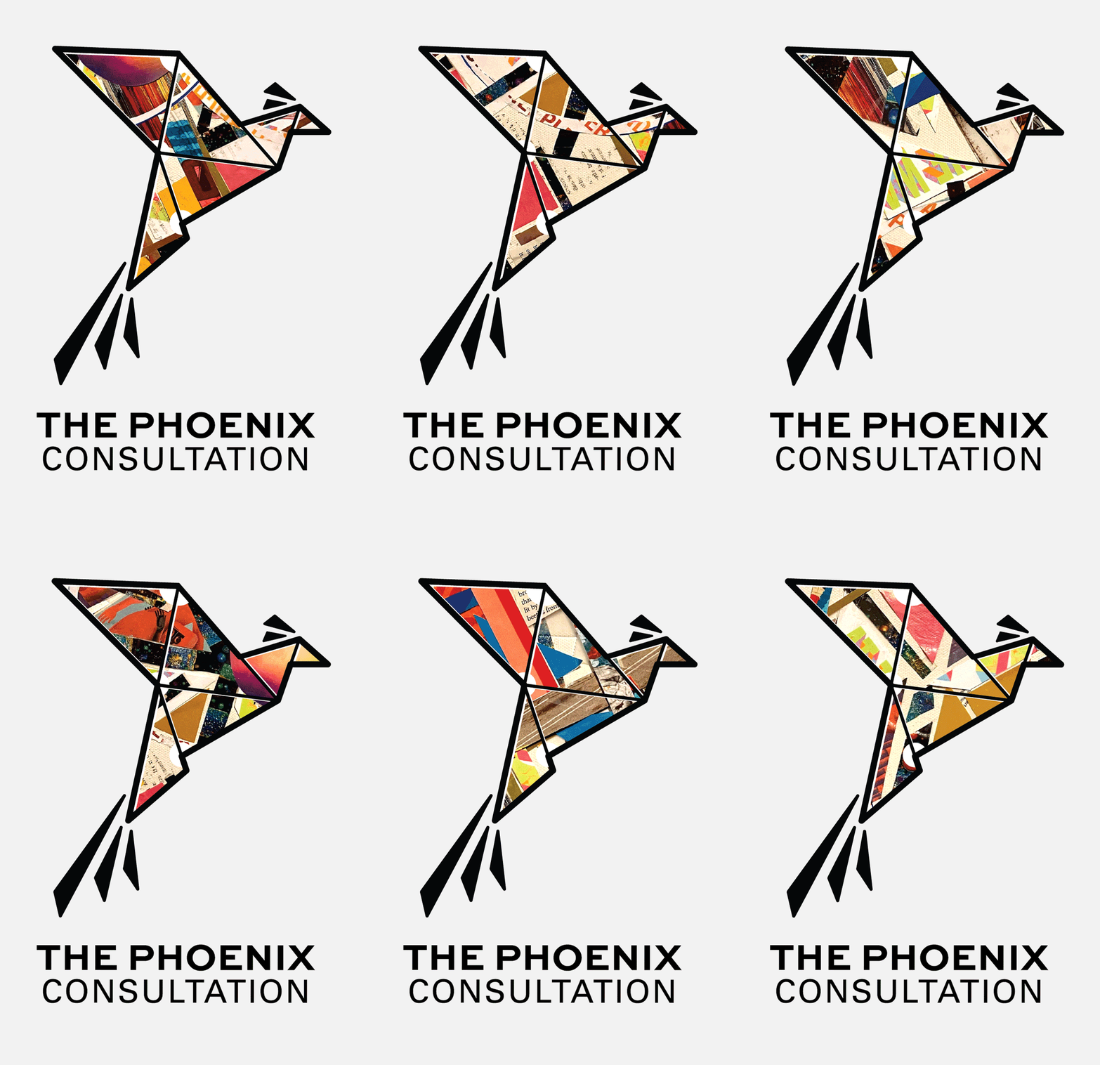
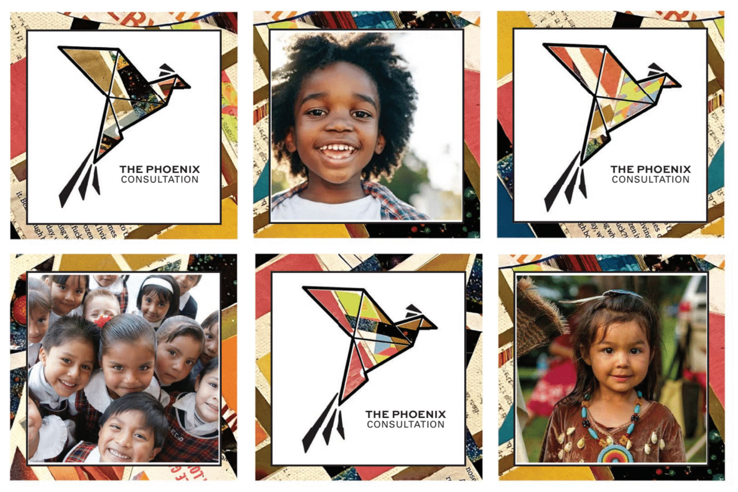
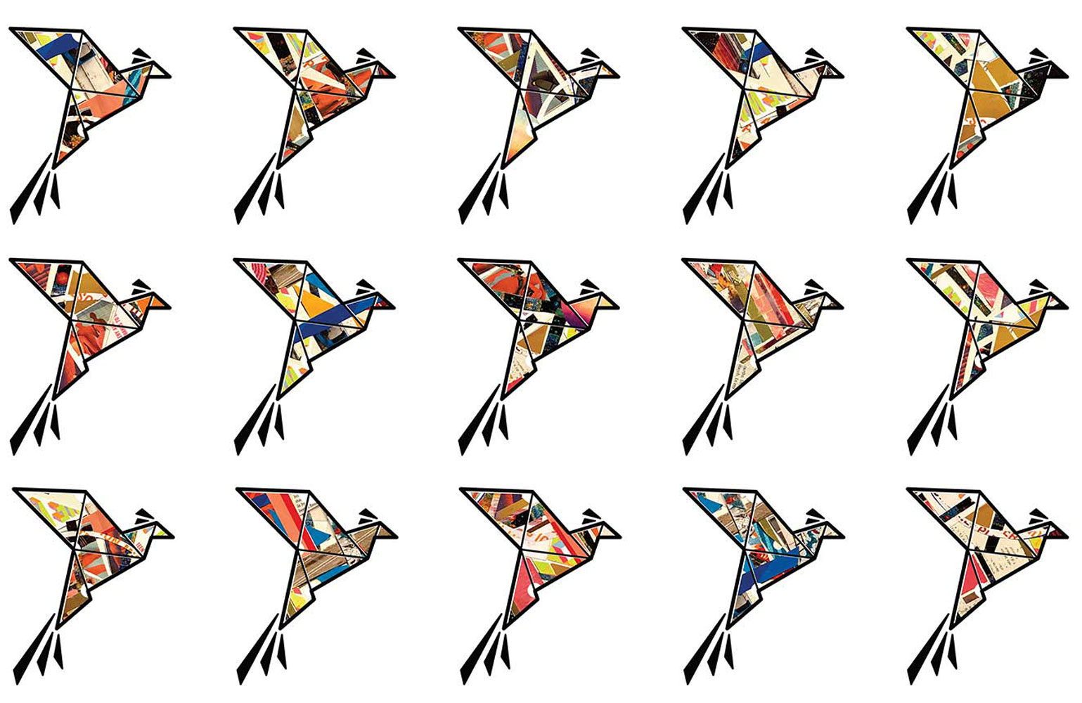
At the center of the system was the phoenix — a symbol of resilience, renewal, and transformation in the face of ecological crisis. Rather than creating a single static logo, the identity evolved into a modular series of sixteen distinct phoenix forms assembled from diverse artistic textures, colours, and graphic influences.
This approach allowed the system to reflect both shared purpose and individual expression — reinforcing the idea that climate action emerges not from uniformity, but from interconnected communities bringing different experiences, cultures, and creative voices into collective movement.
The broader visual language drew inspiration from youth-led activism, collage practices, street graphics, editorial design, and participatory art-making. The resulting system balanced urgency and optimism while remaining flexible across digital platforms, consultation materials, presentations, and promotional assets.
The resulting identity system provided the Phoenix Consultation with a visually distinctive and emotionally resonant public presence capable of supporting a large-scale international consultation process.
More importantly, the work helped establish a framework that centered:
The project reflects Wall On The Fly’s broader approach to identity work: creating visual systems that function not simply as branding, but as containers for community, participation, and cultural momentum.